Overview
Wild Petals Collective is a community-based brand focused on PCOS awareness and women’s health. The landing page was designed as the brand’s first digital touchpoint - building presence and community before the full website launch.
Goals
- Introduce the brand and its mission to the target audience
- Drive registrations to grow the early community
- Establish a tone of care, credibility, and inclusivity around PCOS and endometriosis
The challenge
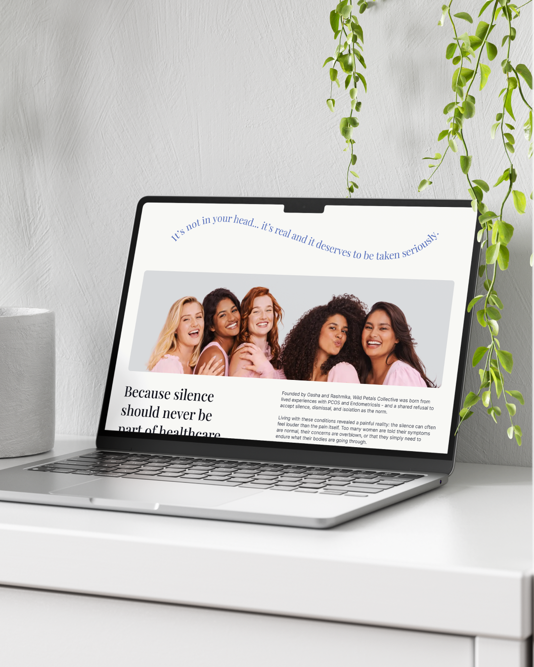
Starting a design without a brand guideline is both a creative opportunity and a responsibility. There were no defined colour palettes, no type scales, no tone-of-voice documentation to pull from. The only anchor was the logo.
For a brand dealing with something as personal as hormonal health, getting the visual language wrong carries real weight. Too clinical and it feels cold. Too soft and it loses credibility. The design needed to earn trust while feeling warm and human.
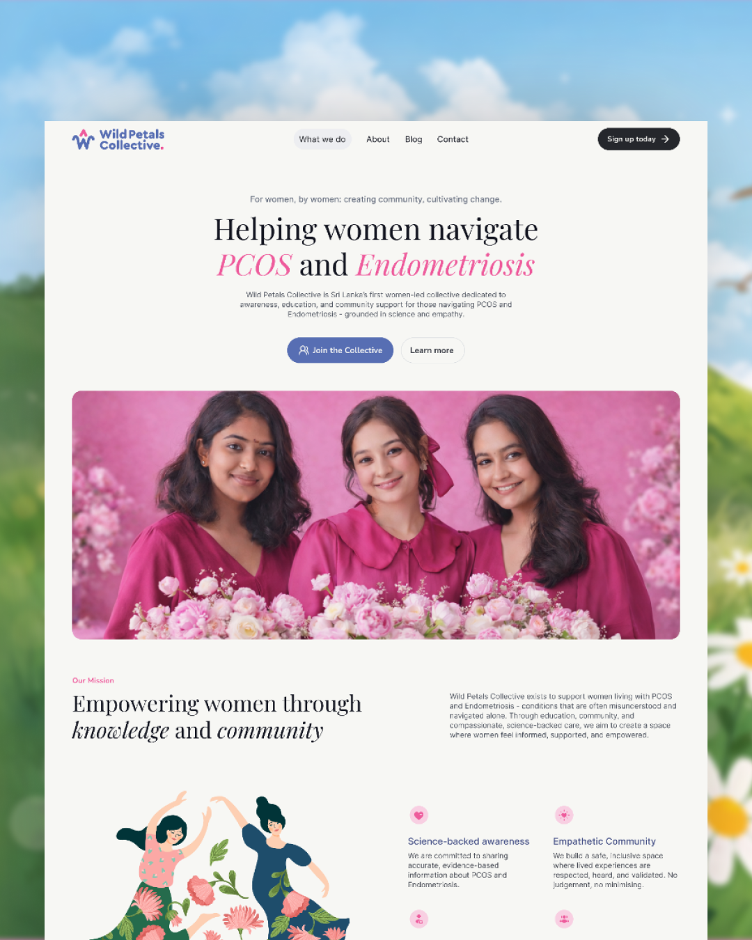
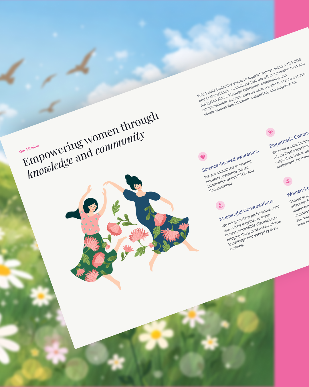
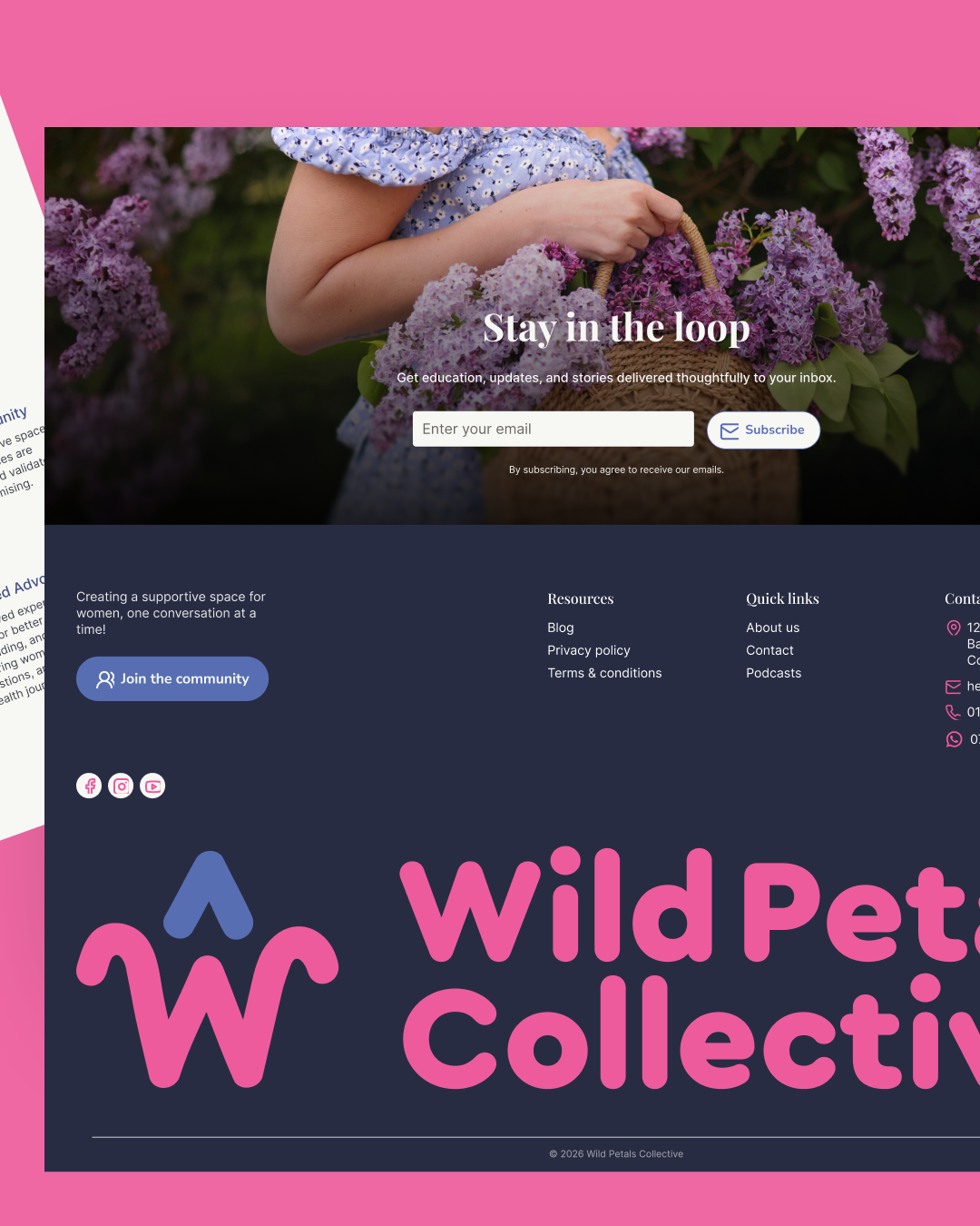
Building the visual identity
Colors
Rather than introducing an entirely new palette, I extracted the colours directly from the logo and built the system from there. The palette centres around a vivid pink and a cool blue - pink drives attention to key moments like highlighted text and icons, while blue anchors interactive elements. The soft background tones keep the layout breathable without competing with either.
 Typography
I paired Playfair Display with Inter. Playfair brings editorial elegance to the headings - its serif character and slight vintage quality add warmth and intention, which matters in a health-adjacent context. Inter keeps the body copy clean and legible across screen sizes. The pairing works through contrast: Playfair brings character and emotion, Inter brings clarity. One draws you in, the other keeps you reading.

Design direction
The overall aesthetic was soft, feminine, and professional. Not a typical health brand look - no sterile whites and clinical blues - but also not a lifestyle blog. The goal was something in between: a space that felt like it was designed for women, not at them.
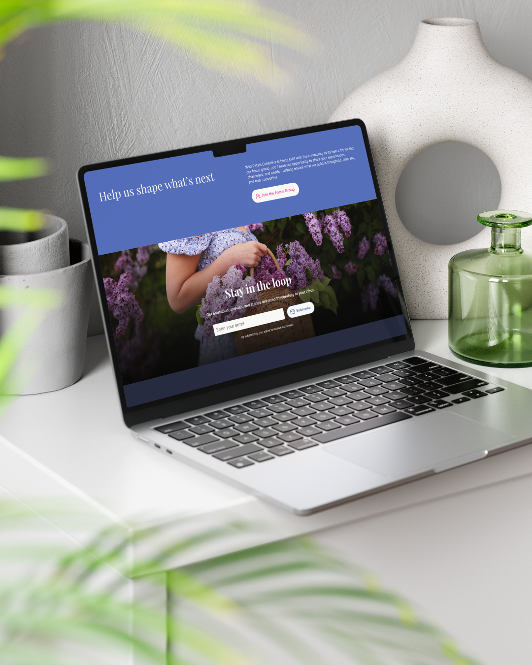
Beyond the landing page
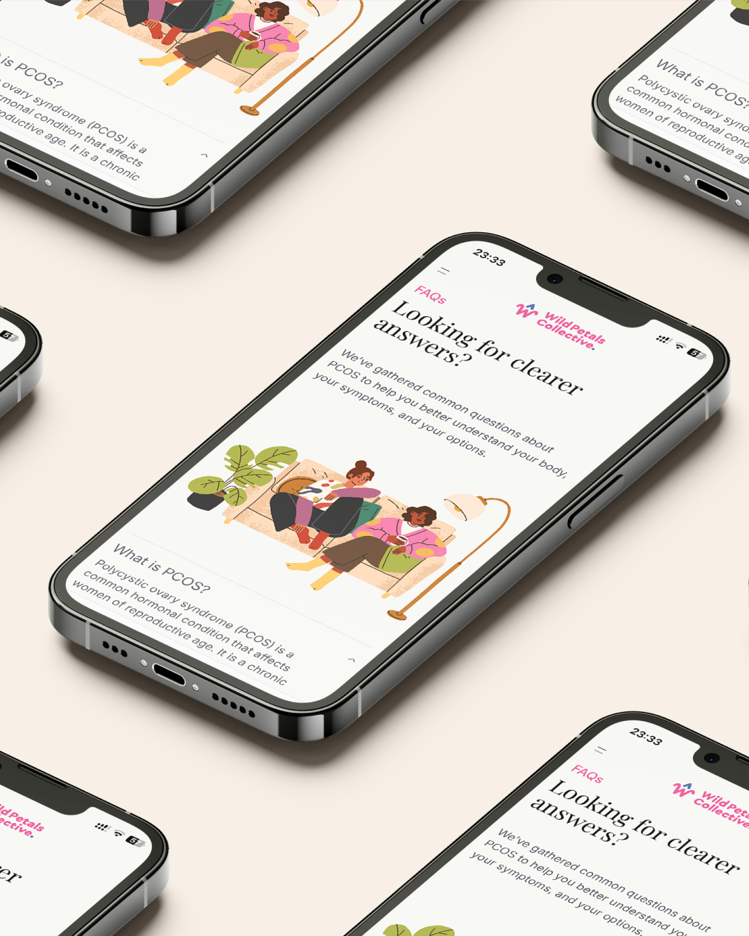
As a complementary deliverable, I also designed a blog page. This wasn’t part of the original brief, but it was a natural addition. A blog gives the brand a channel to publish health content, share community stories, and build topical authority over time - all of which feeds directly into SEO. For a brand in its early stages, organic search visibility is one of the most valuable long-term investments, and having the blog page ready to go meant the brand could start building that foundation from day one.
Outcome
The project resulted in a cohesive design system built from scratch - colour palette, typography, spacing, and component style - that the brand can carry forward into its full website. The landing page gives Wild Petals Collective a credible, warm, and intentional first impression, and the blog page sets up the infrastructure for content growth.
It’s a project that reminded me how much design work happens before a single frame is built: understanding what a brand stands for, who it’s speaking to, and what it needs to make someone feel safe enough to say this is my community.