Cleopatra Ceylon is a beauty and self-care brand built for a new generation - one that sees femininity as a form of strength and self-care as something worth showing up for. The project came with a clear vision and the creative freedom to build an identity that could carry it. The brief was to design a brand and website that felt bold and intentional - something that spoke directly to a younger audience without blending into the sea of earthy, neutral-toned beauty brands dominating the space right now.
Building the Visual Identity
Colour
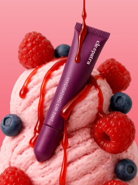
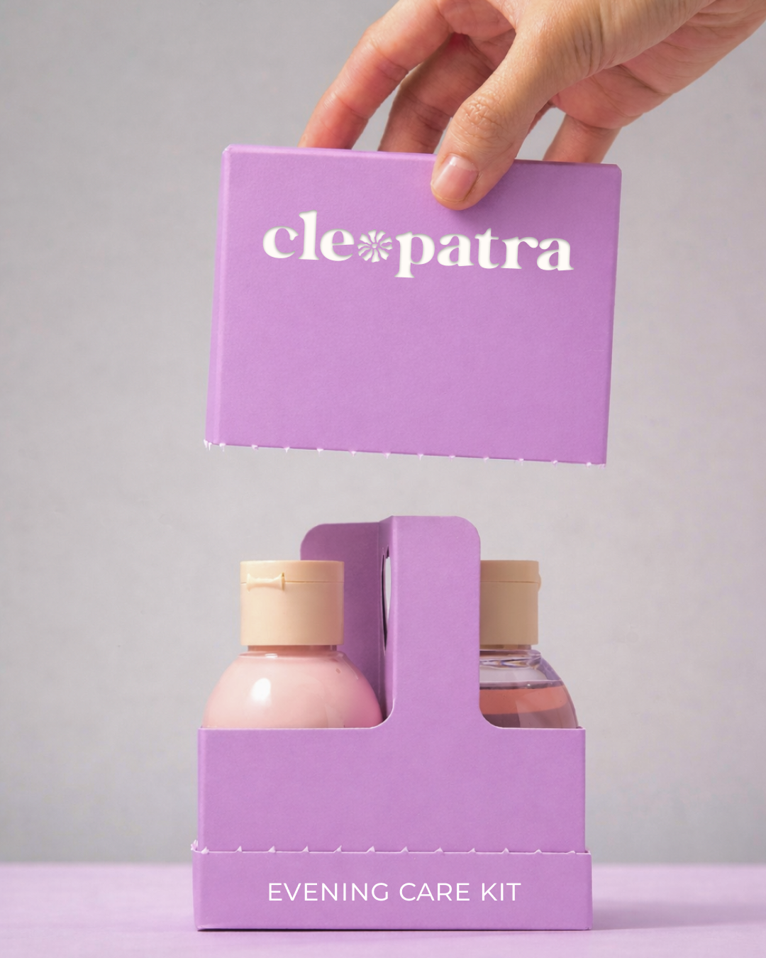
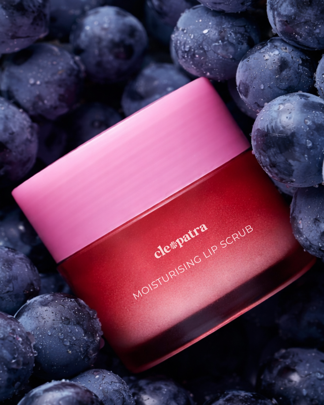
Purple leads the palette - confident, distinctive, and a deliberate departure from the muted tones that define so much of the beauty industry today. It reflects where this brand stands: expressive, unapologetic, and speaking to an audience that wants to be seen. The off-white keeps everything balanced without dulling the impact.
Identity
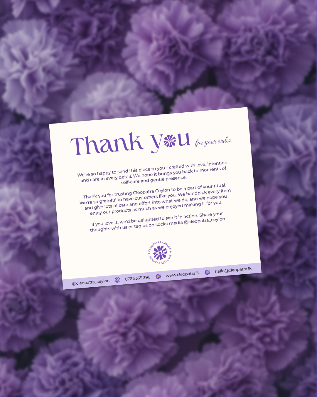
A custom floral emblem sits at the heart of the brand. Designed to feel both soft and structured, it carries a sense of renewal and self-devotion without over-explaining it - the kind of mark that means something without needing a caption.
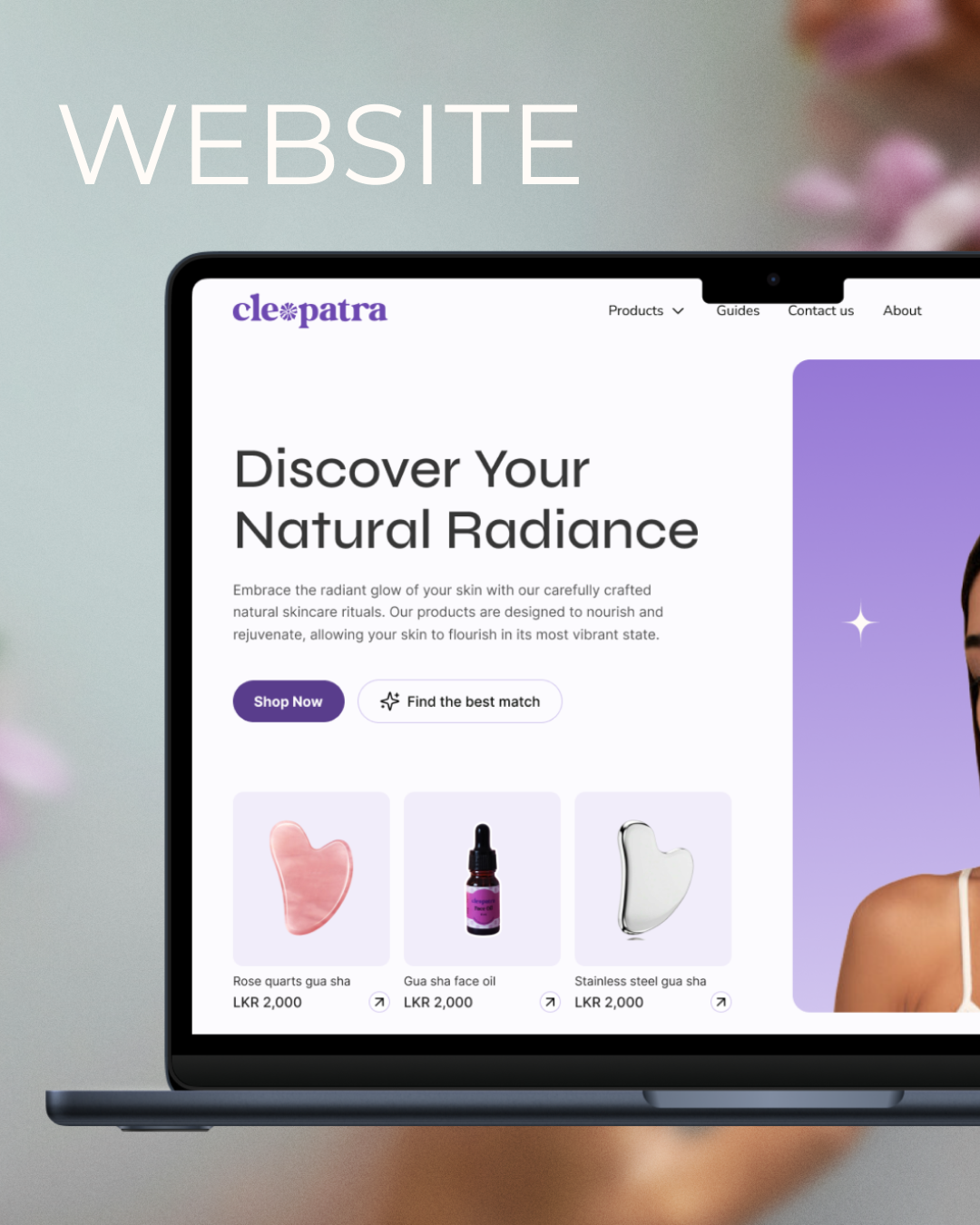
Website
The website was built with the same mindset as the identity - clean, considered, and easy to move through. The shopping experience is stripped back to only what’s necessary, so every visit feels effortless and every decision feels natural. As an emerging brand in its early growth stage, both the identity and the website are built to scale as Cleopatra Ceylon grows.
The results spoke for themselves. After the website launched, sales doubled - a clear sign that minimal, easy user experience directly supports the conversions.