Vistas Lanka is a travel and tour company offering curated itineraries, day tours, taxi rentals, and custom tour experiences. The project covered everything from brand identity to website - built to position the brand in the modern luxury travel space and stand out in a competitive market.
Brand Identity
The identity was built around the feeling of Sri Lanka itself - adventurous, vibrant, modern, and alive.
The primary logo uses elegant display lettering with clean, refined lines. The final letter “A” in Lanka is cleverly transformed into a map pin - a subtle but intentional nod to travel and exploration that feels integrated rather than added on. It’s the kind of detail that rewards a second look without demanding one. The simplicity keeps it versatile and timeless, while the contemporary execution positions the brand as sophisticated and forward-thinking.
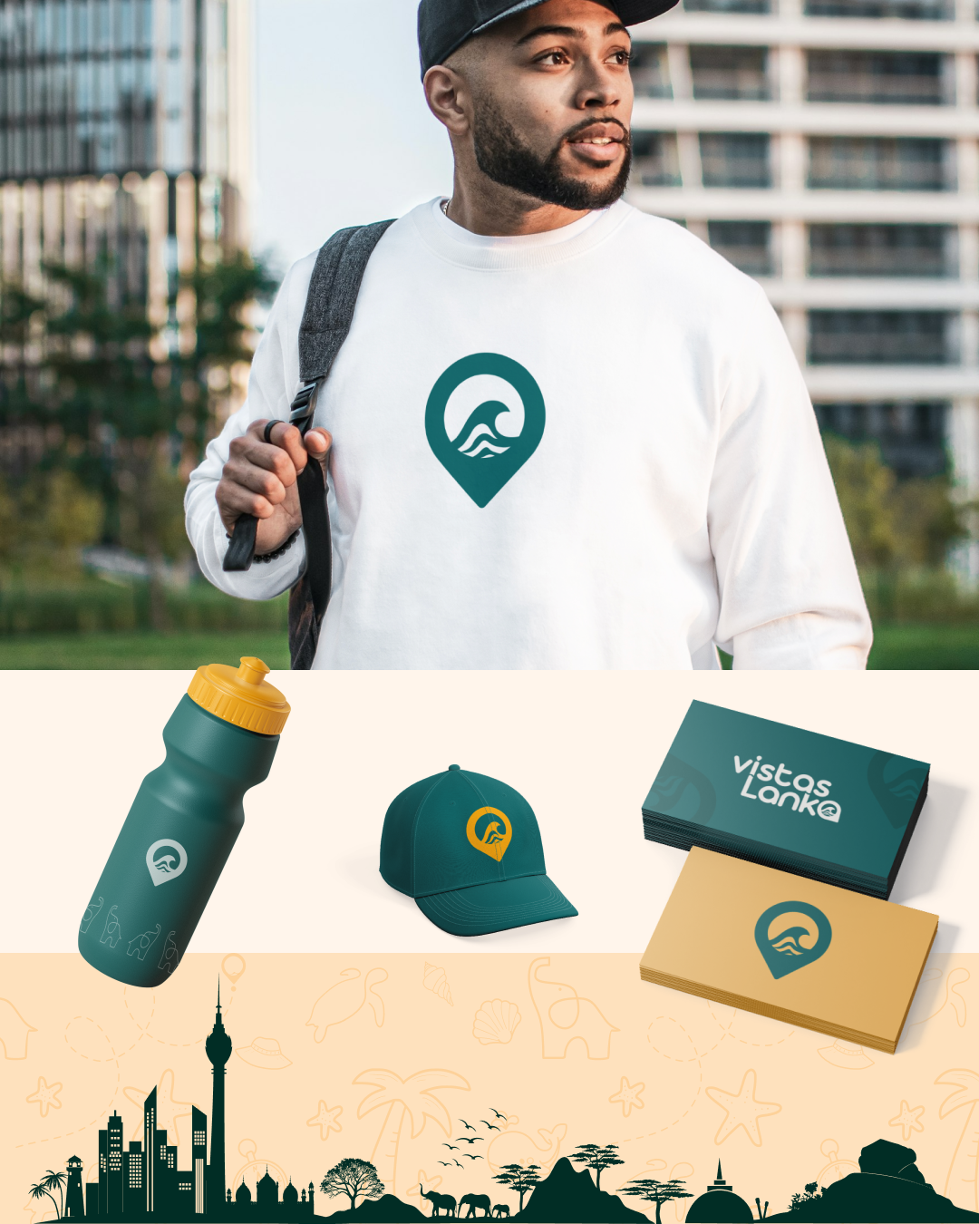
 The submark takes the map pin further - this time as a standalone icon with wave patterns inside that read as both ocean and mountain ranges, capturing Sri Lanka’s two defining landscapes in a single compact mark. It’s built for the places the full logo can’t go: social media profiles, watermarks, packaging, and small-scale applications where instant recognition matters most.
Most competitors in the Sri Lankan travel space default to blue and yellow - so rather than follow the pattern, the palette was built around a deep teal, a rich black, and a warm amber inspired by the king coconut. The teal reflects the lush greenery and ocean, the amber brings in the energy of adventure and golden sunsets, and the coconut white keeps everything breathable and balanced. The result is a palette that feels familiar enough to read as travel, but distinctive enough to be remembered.
 Website Design
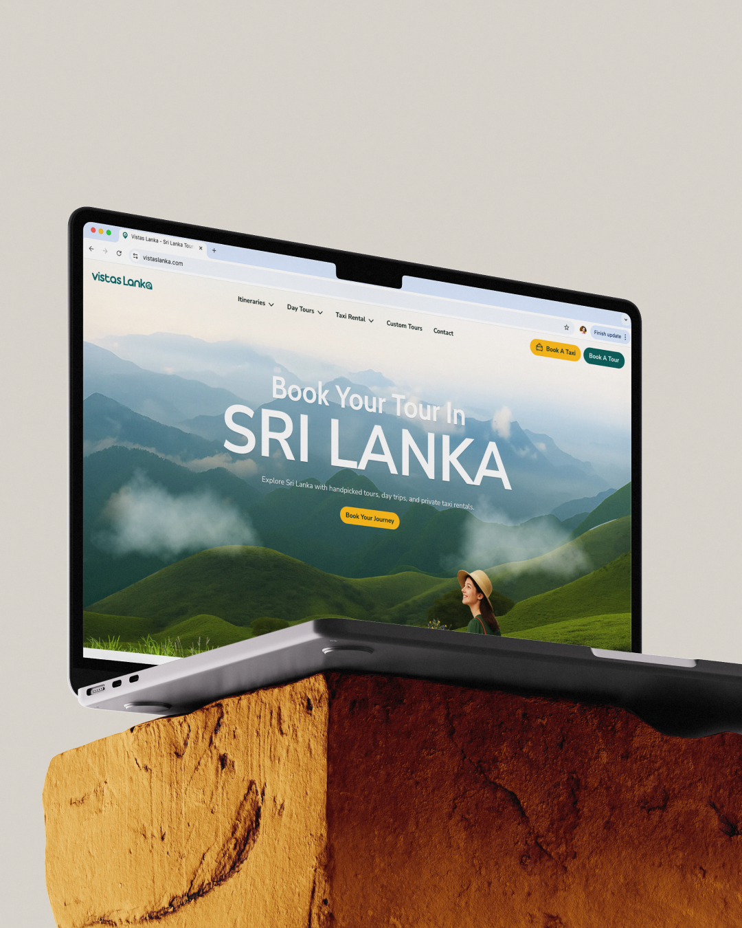
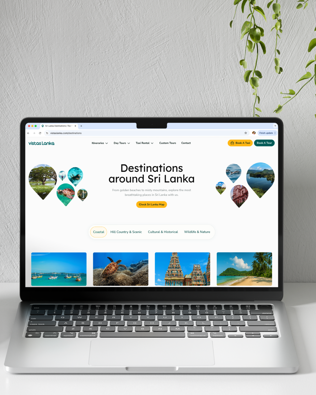
Competitor research made one thing clear - most travel websites in this space are visually cluttered and poorly structured, making what should be a simple decision feel unnecessarily overwhelming.
The design direction for Vistas Lanka was a direct response to that gap. The layout is modern, minimal, and generous with white space. The package browsing experience is built with clear categorisation across itineraries, day tours, taxi rentals, and custom tours - each distinct in offering but consistent in structure, so visitors can move through the site without losing context.
The website leans heavily into travel imagery - intentionally. Seeing beautiful locations and real experiences creates desire in a way that words alone can’t. It puts the visitor in the feeling of travel before they’ve made any decision, which is an important factor for decision making.
One challenge with heavy media is loading speed. To counter this, all images are optimised for web without compromising visual quality. Key visuals load instantly with priority, while the rest load quietly in the background, so the site always feels fast without feeling empty.
The website is custom coded end to end, with direct booking functionality integrated through a payment gateway. For travellers who want something more tailored, a custom tour request can be submitted through a simple form - keeping the experience accessible regardless of what someone is looking for.
Animations were kept intentionally subtle. The audience spans a wide range of backgrounds and travel preferences, and a heavy motion experience risks alienating as many people as it impresses. The interactions that exist are quiet and purposeful - adding polish without demanding attention.
The result is a website that reflects the brand’s positioning: refined, easy to trust, and built to convert.